20 Best Paint Colors for Your Living Room
Choosing the perfect paint color for your living room can transform your space, setting the mood and enhancing your decor. Whether you prefer warm neutrals, calming blues, or bold statement shades, the right color can make all the difference. From cozy earth tones to modern grays and refreshing greens, this list of the 20 best living room paint colors will inspire your next home makeover. Get ready to refresh your space with colors that bring warmth, elegance, and personality to your home.
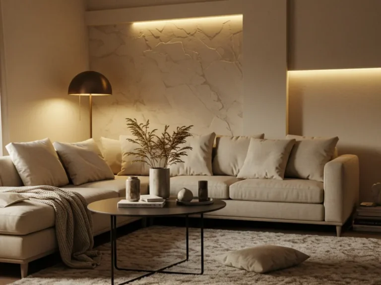
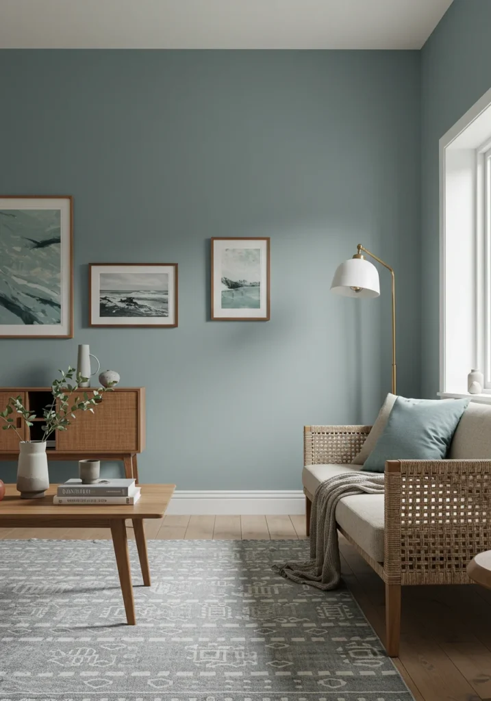
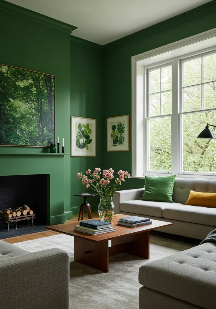
Whispering Willow
Whispering Willow is a soft, airy green that instantly brings a sense of calm and tranquility into any living space. Its soothing tone draws inspiration from the gentle sway of willow trees, capturing the feeling of quiet moments in nature. Unlike bold greens, this shade carries a muted quality that makes it both refreshing and understated. The result is a color that creates an inviting atmosphere, perfect for unwinding after a long day.
This versatile shade is enhanced by its subtle undertones of gray and beige, which lend it a sophisticated edge. These nuances allow Whispering Willow to adapt beautifully to a wide range of interior styles, from rustic cottages to sleek, modern homes. When paired with natural light, the color takes on a soft glow, further enhancing its calming presence. It feels neither too cool nor too warm, making it a balanced choice for year-round comfort.
Designers often recommend pairing Whispering Willow with natural wood accents, which bring out its earthy depth. Crisp white trim or furniture provides a clean contrast, while soft neutrals such as cream or taupe add layers of warmth and harmony. These combinations highlight the color’s flexibility, allowing homeowners to customize their spaces effortlessly.
Whether you dream of a nature-inspired retreat or a polished modern setting, Whispering Willow brings serenity and timeless elegance to your home. Its delicate balance of freshness and coziness makes it a standout choice for living rooms, bedrooms, and beyond. With this shade, you can create an environment that feels both stylish and deeply restorative.
Serene Driftwood
Serene Driftwood is a warm, muted gray that exudes an effortless sense of balance and comfort. With its soft beige undertones, this versatile shade bridges the gap between cozy and modern, making it an excellent choice for creating a welcoming yet refined living space. Inspired by the natural beauty of weathered driftwood along the shoreline, it captures the quiet elegance of coastal landscapes while remaining adaptable enough to suit a wide range of interiors.
What makes Serene Driftwood especially appealing is its neutrality, which allows it to serve as both a backdrop and a statement in design. Its subtle warmth keeps it from feeling too stark, while its gray foundation adds sophistication and depth. This combination creates a calming environment that feels polished without being overwhelming, making it ideal for living rooms, bedrooms, or even open-concept spaces.
When it comes to pairings, Serene Driftwood offers endless possibilities. Crisp whites enhance its clean, airy qualities, while deep blues evoke a coastal or nautical theme. Earthy greens bring in a natural element, adding richness and grounding energy to the room. Whether accented with bold patterns or simple textures, this shade complements a wide variety of décor styles.
Ultimately, Serene Driftwood is more than just a paint color—it is a timeless foundation that adds warmth, serenity, and elegance to your home. Whether your style leans toward rustic charm, coastal relaxation, or sleek modernity, this shade adapts beautifully. Its understated sophistication ensures that your space feels both inviting and effortlessly stylish for years to come.
Golden Hour Glow
Golden Hour Glow is a warm and inviting shade of golden yellow that instantly fills a room with a sense of radiance and comfort. Inspired by the soft light of the setting sun, this hue captures the fleeting beauty of twilight, when everything is bathed in a gentle, golden glow. Its rich yet subtle character allows it to energize a space without being overpowering, making it a perfect choice for living rooms where warmth and togetherness are most cherished.
What sets Golden Hour Glow apart is its ability to strike a balance between vibrancy and subtlety. The presence of soft amber undertones lends the color a grounded elegance, ensuring it feels refined rather than overly bold. This makes it versatile for both traditional interiors that embrace warmth and modern spaces that call for a touch of inviting brightness. The result is a shade that feels both uplifting and soothing, bringing harmony to the room.
Golden Hour Glow pairs beautifully with a variety of complementary tones. Natural wood accents highlight its warmth, creamy whites provide a crisp and clean balance, and deep earth tones enhance its cozy richness. These combinations allow homeowners to adapt the shade for a rustic, classic, or contemporary look with ease.
Ultimately, Golden Hour Glow is more than just a color—it is an atmosphere. It brings comfort, light, and elegance into the home, transforming any room into a welcoming haven. Whether you want to brighten a dim space or infuse your décor with timeless sophistication, this glowing shade ensures your living room always feels inviting and full of life.
Coastal Fog
Coastal Fog is a soft, misty blue-gray that captures the tranquil beauty of an early morning by the sea. Gentle and airy, this cool-toned shade creates a calming presence that instantly soothes the senses. Much like the quiet stillness of fog rolling across the shoreline, it offers a sense of peace and renewal, making it an ideal choice for living rooms, bedrooms, or any space designed for relaxation and retreat.
What makes Coastal Fog truly special is its versatility. With subtle hints of gray and silver woven into its base, it takes on a refined character that feels elegant without being overly formal. Its cool undertones create a fresh and airy atmosphere, perfect for opening up a room and giving it a sense of spaciousness. This quality allows Coastal Fog to act as a beautiful backdrop while also standing on its own as a statement color.
In terms of pairings, this shade is effortlessly adaptable. Crisp whites highlight its freshness and enhance its coastal charm, while natural wood tones add warmth and balance. Soft neutrals such as beige, taupe, or light gray complement it gracefully, making it easy to layer textures and create depth. These combinations work equally well in modern settings or breezy, coastal-inspired interiors.
Ultimately, Coastal Fog transforms any room into a peaceful oasis. It is a color that invites stillness, reflection, and comfort, while maintaining timeless elegance. Whether your goal is to bring a touch of seaside serenity indoors or to craft a sophisticated, airy living space, Coastal Fog delivers an enduring sense of calm and effortless beauty.
Velvet Ember
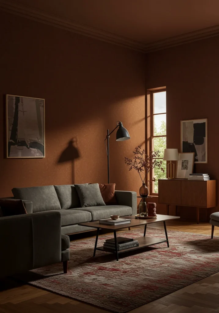
Velvet Ember is a deep, luxurious burgundy that brings a sense of drama, richness, and elegance into any living space. Inspired by the glowing warmth of smoldering embers, this shade carries both intensity and comfort, making it a color that feels bold yet inviting. Its velvety depth instantly adds character to a room, transforming ordinary walls into a sophisticated backdrop that radiates warmth and style.
What makes Velvet Ember truly captivating is its balance of boldness and refinement. The rich undertones of red and warm plum give it a layered, dimensional quality that shifts beautifully with changing light. During the day, it feels warm and vibrant, while in the evening it takes on a cozy, intimate glow. This duality makes it ideal for creating a living room atmosphere that is both dramatic and welcoming, perfect for entertaining or relaxing.
Velvet Ember is highly versatile when paired with complementary tones. Soft neutrals, such as cream or warm gray, balance its richness, while gold accents highlight its luxurious side. Dark wood furniture or flooring enhances its depth and adds a grounded elegance, creating a palette that works seamlessly in both modern and traditional interiors.
Ultimately, Velvet Ember is a color that makes a statement while remaining timeless. It infuses any room with a sense of sophistication, warmth, and character that never feels fleeting or trendy. Whether used on a feature wall or throughout a space, this shade creates an atmosphere of refined comfort that elevates your home with enduring beauty.
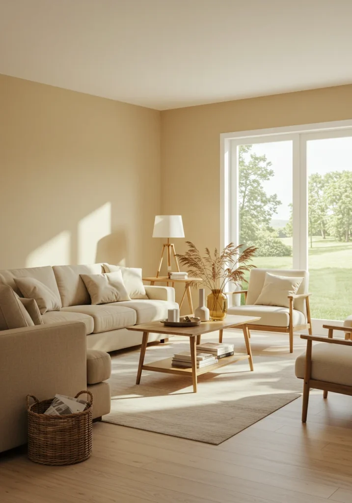
Soft Sand
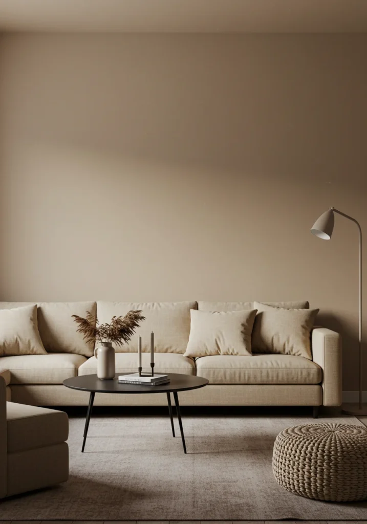
Soft Sand is a warm, light beige that radiates comfort and understated beauty. With its subtle golden undertones, it brings a gentle glow to any living space, creating an atmosphere that feels both inviting and serene. Inspired by sun-kissed shores and the calming rhythm of nature, this shade embodies a sense of relaxation and ease, making it an ideal choice for living rooms, bedrooms, and open gathering spaces where warmth and comfort are essential.
The elegance of Soft Sand lies in its versatility. Unlike cooler neutrals, its warmth prevents it from feeling stark or flat, while still offering a clean, refined backdrop. Its golden undertones add a hint of brightness, allowing it to catch the light beautifully throughout the day. Whether your home leans toward modern minimalism or traditional charm, this shade adapts effortlessly, bringing balance and cohesion to the room.
Soft Sand pairs harmoniously with a wide range of colors and textures. Crisp whites provide a fresh contrast, enhancing its warm glow, while deep earth tones create a rich and grounded palette. For a softer, more delicate look, pair it with pastels such as blush, sage, or powder blue. Natural materials like rattan, oak, and linen further complement its relaxed, organic quality.
Ultimately, Soft Sand is more than just a neutral—it is a foundation that sets the tone for warmth, comfort, and timeless elegance. Its natural serenity ensures that any space feels inviting and effortlessly sophisticated. Whether you’re creating a breezy coastal retreat or a polished, classic interior, Soft Sand provides the perfect canvas for a beautiful and welcoming home.
Midnight Sky
Midnight Sky is a deep, moody navy blue that brings a striking sense of sophistication and drama to any interior. Inspired by the stillness and mystery of the night sky, this rich shade exudes elegance while creating a cozy, intimate ambiance. Its velvety depth draws the eye and instantly transforms a room into a space that feels both bold and refined, making it a perfect choice for those who want to add character and timeless style to their home.
What sets Midnight Sky apart is its versatility. Though dark and dramatic, its balanced undertones prevent it from feeling heavy or overwhelming. In natural daylight, the blue reveals a subtle vibrancy, while in softer evening light it takes on a richer, more enveloping quality. This ability to shift with the light makes it a dynamic choice for living rooms, bedrooms, or even dining areas, where mood and atmosphere are essential.
Pairing options for Midnight Sky are both classic and contemporary. Crisp whites provide a sharp, refreshing contrast, while warm gold accents highlight its luxurious side. Natural wood tones bring balance and warmth, softening the drama without diminishing its elegance. For a more modern palette, it also complements muted grays and lighter neutrals, creating a striking yet harmonious look.
Ultimately, Midnight Sky is a color that transforms any space into a refined and timeless retreat. Whether used as a dramatic feature wall or throughout an entire room, it creates an atmosphere that is both sophisticated and welcoming. Bold yet versatile, it offers enduring beauty that resonates across design styles, from modern minimalism to traditional elegance.
Frosted Pearl
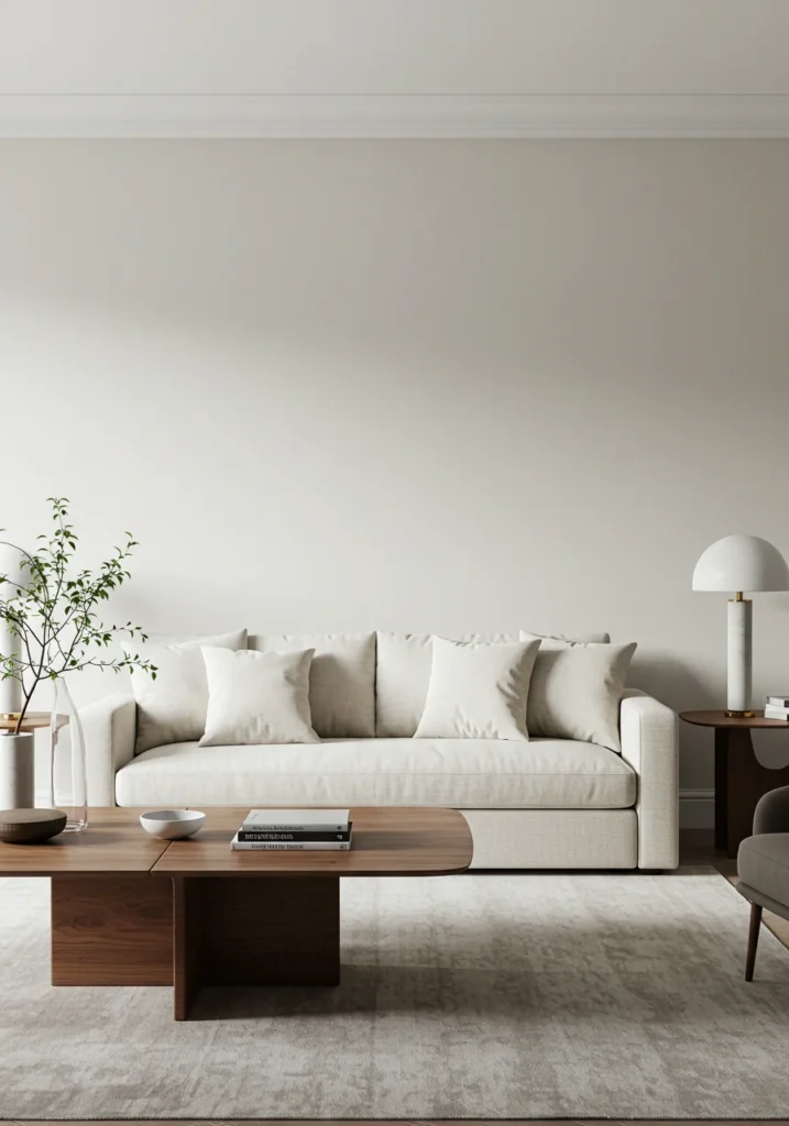
Frosted Pearl is a soft, luminous off-white that captures the quiet elegance of a pearl’s subtle shimmer. With delicate hints of gray and silver, this refined shade creates an airy, open atmosphere that feels both fresh and timeless. Its gentle radiance makes it especially well-suited for living rooms, where natural light can highlight its depth and glow, transforming any space into a serene retreat.
What makes Frosted Pearl so appealing is its versatility. Unlike stark whites, its undertones give it a sense of warmth and softness, ensuring it never feels cold or clinical. At the same time, its silvery edge adds sophistication, allowing it to bridge the gap between contemporary minimalism and classic elegance. This balance makes it a perfect choice for homeowners seeking a color that is subtle yet impactful, understated yet memorable.
Frosted Pearl pairs beautifully with a wide range of colors and finishes. Deep blues and rich greens highlight its cool sophistication, while soft pastels bring out its delicate luminosity. Natural wood tones add warmth and balance, grounding its lightness and creating harmony within the room. Metallic accents—especially silver or brushed nickel—further enhance its elegant, pearlescent quality.
Ultimately, Frosted Pearl is more than just an off-white—it is a foundation for style and serenity. Whether used throughout a room or as a complement to bolder shades, it enhances the overall atmosphere with a sense of openness and tranquility. From modern minimalist spaces to timeless traditional interiors, Frosted Pearl brings light, balance, and refined sophistication to any home.
Urban Fog
Urban Fog is a sleek, modern gray that offers both balance and sophistication to any interior. With gentle undertones of warm taupe, this shade softens the coolness often associated with gray, creating a color that feels inviting while remaining refined. Inspired by the quiet haze of a city skyline, Urban Fog captures the serenity and subtle beauty of urban landscapes, making it a versatile choice for living rooms, bedrooms, or open-plan spaces where style and comfort meet.
The strength of Urban Fog lies in its adaptability. It provides enough depth to add interest to a room without overpowering other design elements, serving as an elegant backdrop that allows furnishings and accents to shine. Its neutral base works well in both natural and artificial light, maintaining its sophisticated tone throughout the day. This makes it a dependable foundation for interiors that seek timeless appeal as well as modern edge.
When it comes to pairings, Urban Fog is exceptionally versatile. Bold accent colors—such as deep navy, forest green, or even vibrant jewel tones—stand out beautifully against its neutral background. Metallic finishes like brushed brass, chrome, or matte black enhance its contemporary charm, while natural textures such as wood and stone create warmth and balance, preventing the space from feeling too stark.
Ultimately, Urban Fog is a shade that embodies effortless elegance and modern charm. Whether you’re aiming to design a chic urban loft with sleek lines and bold contrasts, or a cozy, understated retreat with layered neutrals and textures, this refined gray provides the perfect canvas. It is a timeless color that adapts seamlessly to a wide variety of design visions, ensuring your home feels both stylish and welcoming.
Blush Mist
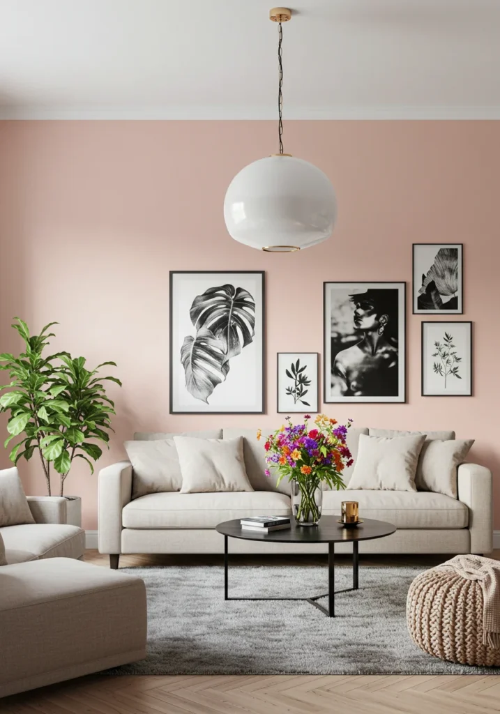
Blush Mist is a soft, gentle pink that carries a delicate warmth, reminiscent of the first light of dawn. Subtle yet uplifting, this hue brings a sense of freshness and serenity to any living space. Its understated character allows it to brighten a room without overwhelming it, making it an ideal choice for creating a calm, welcoming atmosphere. Inspired by the quiet glow of early morning skies, Blush Mist feels both modern and timeless, offering a touch of softness that enhances the overall harmony of a home.
What makes Blush Mist truly versatile is its muted quality. Unlike brighter pinks, it is refined and subdued, allowing it to act as a neutral backdrop while still adding a hint of personality and charm. Its airy tone works especially well in living rooms, bedrooms, or reading nooks where comfort and relaxation are essential. With the right lighting, it reflects a gentle radiance that enhances the natural flow of a space, keeping it light and inviting.
Blush Mist pairs beautifully with a variety of complementary tones and finishes. Crisp whites and soft grays highlight its freshness, while beige and taupe add warmth and depth. For a touch of elegance, gold or brass accents bring out its subtle sophistication, creating a palette that feels balanced and harmonious. Natural wood furnishings also work seamlessly with this shade, grounding its airy character with organic texture.
Ultimately, Blush Mist adds more than color—it adds atmosphere. Whether your vision leans toward a modern feminine aesthetic, a relaxed casual vibe, or a subtle hint of elegance, this shade enhances your home with its quiet charm. It is the perfect way to bring a soft, welcoming presence into any room, offering both comfort and sophistication in equal measure.
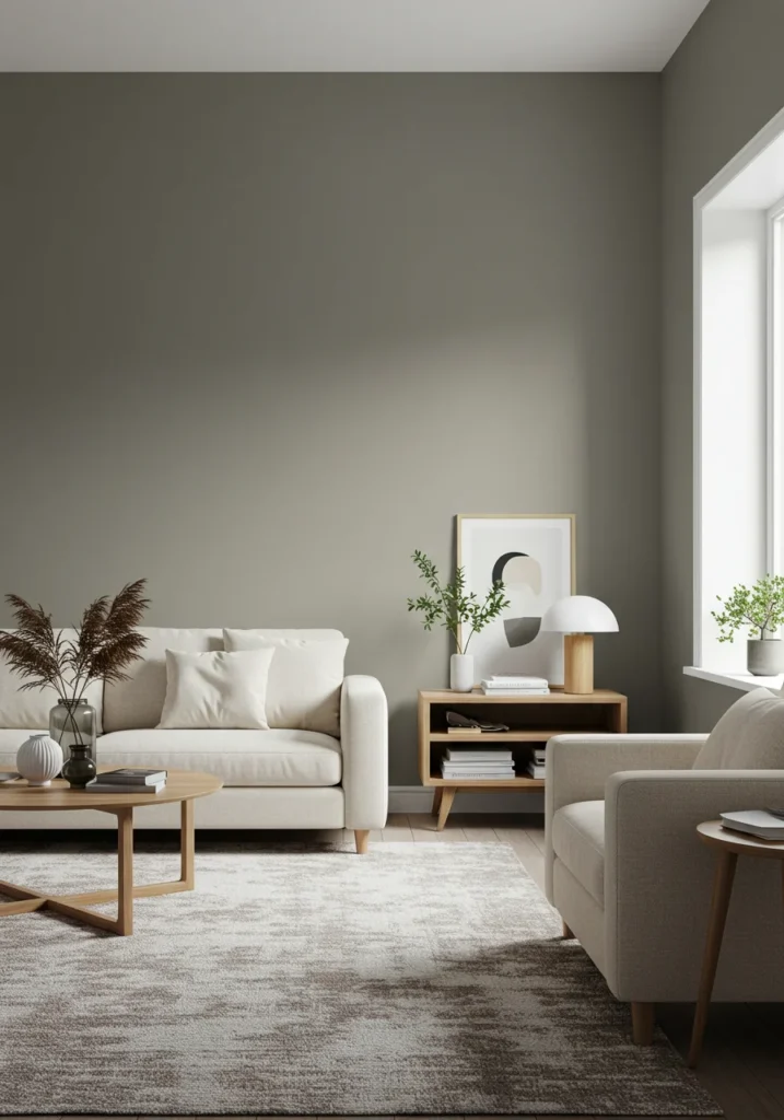
Tumbled Stone
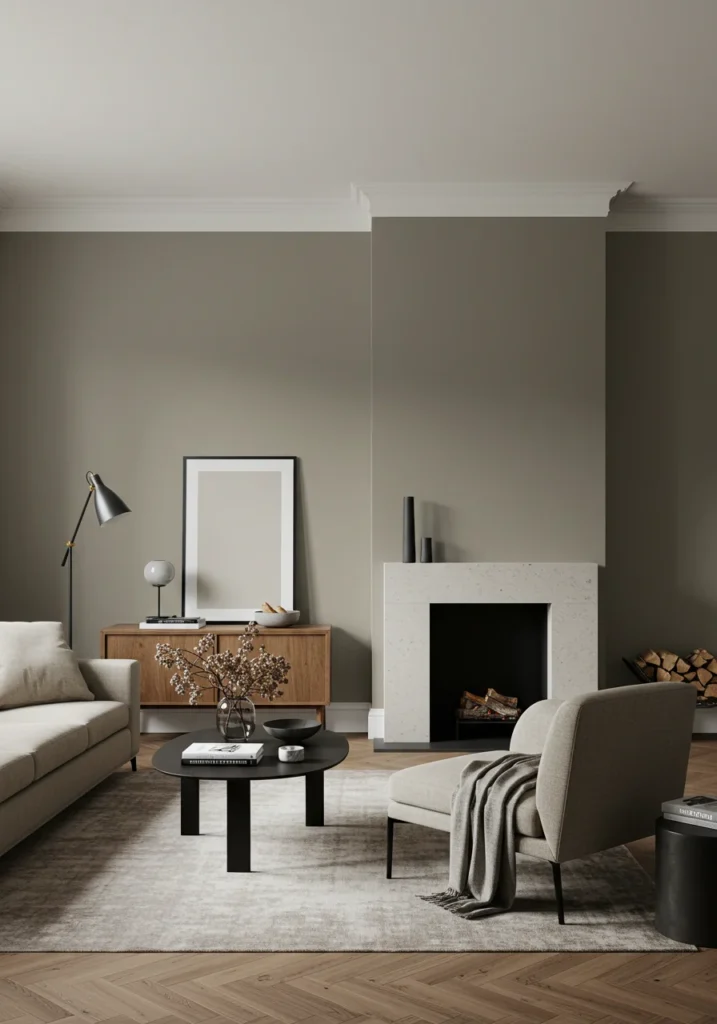
Tumbled Stone is a warm, earthy taupe that captures the natural beauty of stones smoothed and shaped over time. With its soft, grounded undertones, this shade brings a sense of quiet strength and timeless comfort to any living room. Its organic quality makes it feel both rustic and refined, offering the perfect balance between natural warmth and understated elegance. Inspired by the enduring beauty of nature, Tumbled Stone creates a welcoming foundation that feels rooted, cozy, and serene.
The versatility of Tumbled Stone makes it a standout choice for a wide range of interiors. Its neutral base allows it to serve as a backdrop that complements other colors while also offering enough depth to hold its own as a primary wall color. Unlike cooler grays, its warmth adds a touch of softness, ensuring that the room never feels stark or sterile. Whether in natural daylight or evening lighting, Tumbled Stone maintains a harmonious presence that adapts seamlessly to different moods and settings.
Pairing options with Tumbled Stone are abundant and elegant. Wood accents highlight its earthy warmth, while deep greens bring in a sense of nature and tranquility. Soft whites add brightness and balance, creating a crisp yet inviting palette. For added sophistication, metallic accents in bronze or antique gold can enhance its rustic charm, while layered textures such as linen, stone, or leather elevate its natural character.
Ultimately, Tumbled Stone is more than a neutral—it is a grounding color that infuses spaces with warmth and timeless appeal. Whether your style leans toward a cozy, nature-inspired retreat or a polished and sophisticated interior, this shade provides a versatile foundation. It is a color that feels both enduring and adaptable, ensuring that your living room remains welcoming, elegant, and effortlessly stylish for years to come.
Lush Greenery
Lush Greenery is a vibrant, rich green that instantly brings the energizing spirit of nature into your home. Inspired by flourishing foliage and the vitality of the outdoors, this bold shade captures the refreshing beauty of thriving landscapes. It radiates life and renewal, making it an ideal choice for a living room that seeks to balance both energy and serenity. With its dynamic presence, Lush Greenery transforms any space into a sanctuary that feels connected to the natural world.
What sets Lush Greenery apart is its ability to feel both lively and calming. While its rich tone adds depth and drama, its natural roots keep it grounded and soothing, avoiding the harshness of overly bright greens. In daylight, it shines with vibrancy and freshness, while under softer evening light it settles into a more tranquil, enveloping shade. This balance makes it a versatile color, equally suited for statement walls or as the main backdrop in a room designed to feel welcoming and restorative.
Pairing Lush Greenery with complementary elements enhances its natural charm. Earthy neutrals such as taupe, beige, or stone gray highlight its organic warmth, while wooden accents reinforce its connection to nature. Metallic touches—especially brass or copper—add a layer of sophistication, creating an elegant contrast that elevates the palette. For a contemporary twist, pair it with crisp whites or charcoal accents to achieve a balanced, modern look.
Ultimately, Lush Greenery is more than a bold shade—it is a statement of vitality, balance, and timeless elegance. Whether your vision is to design a lively, invigorating space or a serene retreat inspired by the natural world, this shade delivers. Its refreshing presence ensures your living room feels both sophisticated and deeply connected to the calming influence of nature.
Sandy Beach
Sandy Beach is a light, warm beige that evokes the gentle beauty of a sunlit shore. With its soft golden undertones, this shade radiates warmth and tranquility, instantly creating a welcoming atmosphere in any living space. Inspired by the calming presence of coastal sands, it brings the serenity of the beach indoors, making it a perfect choice for those who want to design a home that feels both relaxed and inviting.
The beauty of Sandy Beach lies in its versatility. Its neutral foundation allows it to complement a wide range of styles, from breezy coastal retreats to sleek, modern interiors. Unlike cooler grays or stark whites, its warm undertones ensure that it feels approachable and comfortable, never sterile. Whether bathed in natural sunlight or illuminated by soft interior lighting, Sandy Beach maintains its gentle radiance, adding a subtle glow to the room throughout the day.
Pairing options for Sandy Beach are effortless and elegant. Crisp whites bring out its airy brightness, while soft blues create a soothing coastal-inspired palette. Earthy accents such as taupe, terracotta, or natural wood tones add depth and grounding warmth, enhancing its organic feel. Metallic finishes in brushed gold or bronze further highlight its golden undertones, adding sophistication and refinement.
Ultimately, Sandy Beach is more than just a neutral—it is a foundation for comfort, relaxation, and timeless style. Whether you envision a bright, airy space filled with light or a warm, cozy retreat with layered textures, this shade adapts beautifully. Its understated elegance and natural warmth ensure that your home feels peaceful, inviting, and effortlessly refined.
Dusty Rose
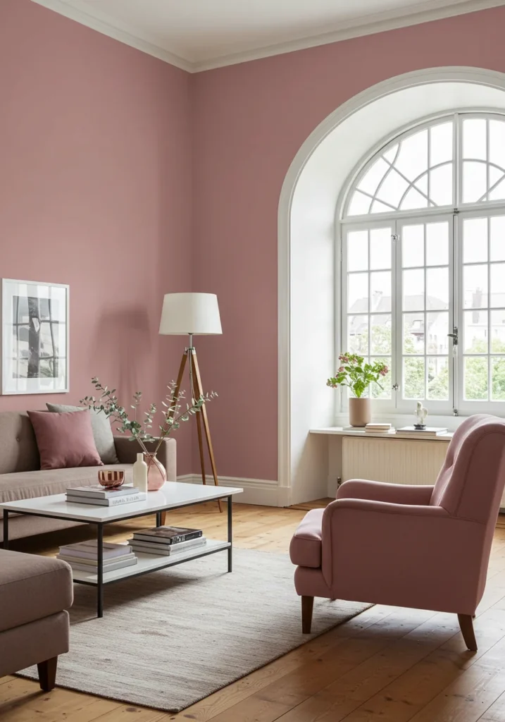
Dusty Rose is a muted, soft pink that carries a refined warmth and an air of timeless charm. With its gentle earthy undertones, this shade strikes a perfect balance between romantic and sophisticated, offering color that feels inviting without being overwhelming. Inspired by vintage elegance and natural beauty, Dusty Rose creates a soothing atmosphere that instantly makes a living room feel cozy, graceful, and welcoming.
Unlike brighter pinks that can feel bold or playful, Dusty Rose has a muted, grounded quality that makes it versatile and enduring. Its soft character brings a sense of calm and relaxation, making it especially suited for spaces where comfort and elegance are equally important. Whether used as the main wall color or as an accent, it introduces warmth in a subtle, refined way, adding depth without overshadowing other elements in the room.
Pairing Dusty Rose with complementary tones opens the door to endless design possibilities. Neutrals such as gray, white, and beige highlight its softness while creating a balanced palette. Natural wood accents enhance its earthy undertones, adding organic warmth, while metallic touches—particularly gold or copper—introduce a touch of glamour. For a layered, romantic look, it also works beautifully with deeper shades like burgundy or muted greens.
Ultimately, Dusty Rose is more than just a soft pink—it is a timeless expression of warmth and elegance. Whether you want to infuse your living room with subtle romance, create a vintage-inspired aesthetic, or simply add a cozy touch of color, this shade delivers. Its quiet sophistication ensures a space that feels both inviting and beautifully enduring.
Golden Wheat
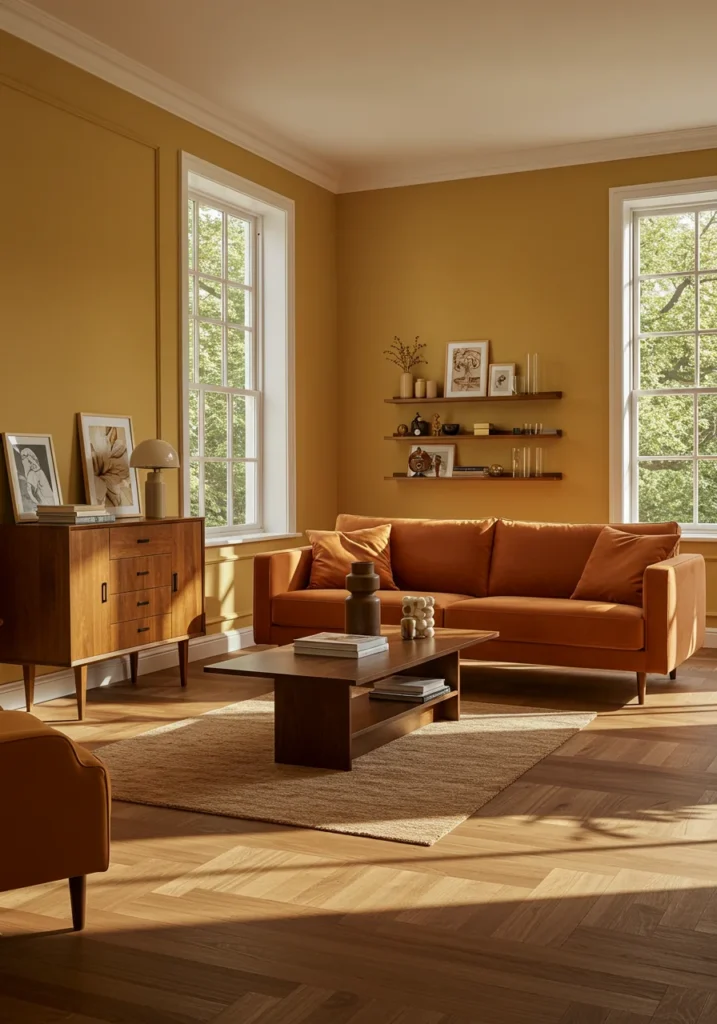
Golden Wheat is a warm, soft yellow that captures the serene beauty of sun-drenched fields swaying in the breeze. With its gentle hint of amber, this shade radiates a sense of natural light and comfort, instantly brightening any living space. Inviting and cheerful, it brings a cozy yet uplifting energy into the home, making it an ideal choice for gathering spaces where warmth and hospitality are at the heart of the design.
What makes Golden Wheat so appealing is its ability to balance vibrancy with subtlety. Unlike bolder yellows, this shade has an earthy depth that prevents it from feeling overwhelming. Its muted undertones create a calm, soothing quality while still maintaining a sunny character, making it a versatile option that adapts seamlessly to both rustic and modern interiors. Whether paired with abundant natural light or used in softly lit rooms, it brings a gentle glow that enhances the atmosphere.
Golden Wheat pairs beautifully with a wide range of complementary tones. Natural wood accents emphasize its organic warmth, while soft greens highlight its connection to nature. Neutral grays create balance and refinement, keeping the palette grounded, while crisp whites offer a clean contrast that brightens the space even further. Together, these combinations create a harmonious and welcoming environment.
Ultimately, Golden Wheat is more than a cheerful hue—it is a foundation of warmth, comfort, and timeless elegance. Whether you are designing a rustic farmhouse-inspired retreat or a warm, contemporary living space, this shade infuses your home with natural radiance. Its ability to be both soothing and uplifting ensures that Golden Wheat remains a versatile and enduring choice for interiors that seek to feel both inviting and beautifully refined.
Eclipse Gray
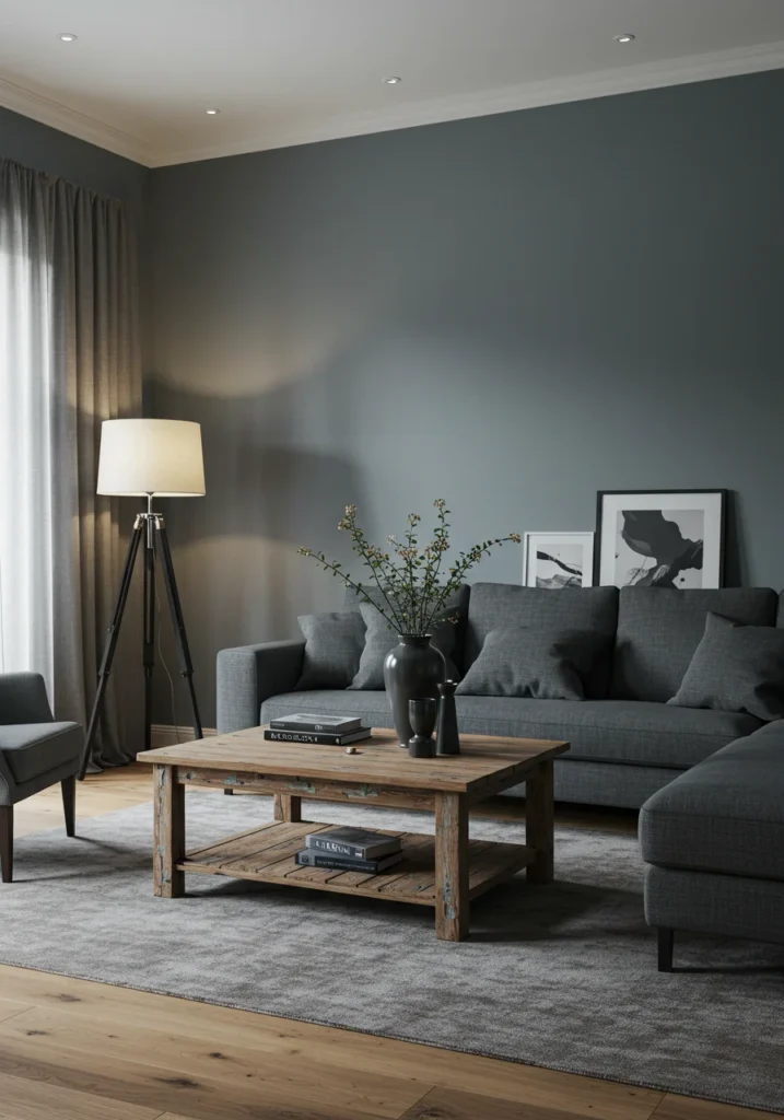
Eclipse Gray is a deep, sophisticated charcoal that embodies the dramatic beauty of a lunar eclipse. With its cool undertones and velvety richness, this shade creates an atmosphere of bold elegance, transforming any living room into a refined and contemporary retreat. Its striking depth makes a powerful statement, while its balance of modernity and timelessness ensures it remains versatile across a variety of design styles.
Unlike lighter grays that serve as subtle backdrops, Eclipse Gray commands attention with its moody presence. Its dark tone creates intimacy, making it perfect for spaces designed to feel cozy, grounded, and stylish. Yet, despite its boldness, it retains a refined sophistication that prevents it from overwhelming a room. Depending on the lighting, it can feel dramatically intense or softly enveloping, giving it a dynamic quality that adapts beautifully to different moods.
Pairing Eclipse Gray with complementary accents enhances its striking appeal. Crisp white trim or furnishings create a bold contrast that feels clean and modern, while metallic finishes—such as gold, brass, or chrome—add a touch of luxury. For a more playful and vibrant palette, bold pops of color like teal, mustard, or crimson stand out beautifully against its dark backdrop, giving the space a contemporary edge.
Ultimately, Eclipse Gray is more than just a dark neutral—it is a statement of sophistication, drama, and timeless style. Whether used as a full-room color to create an enveloping sanctuary or as an accent wall to highlight architectural features, this shade brings depth and elegance. It is a perfect choice for homeowners seeking a modern yet enduring color that elevates their living space with bold refinement.
Lavender Fog
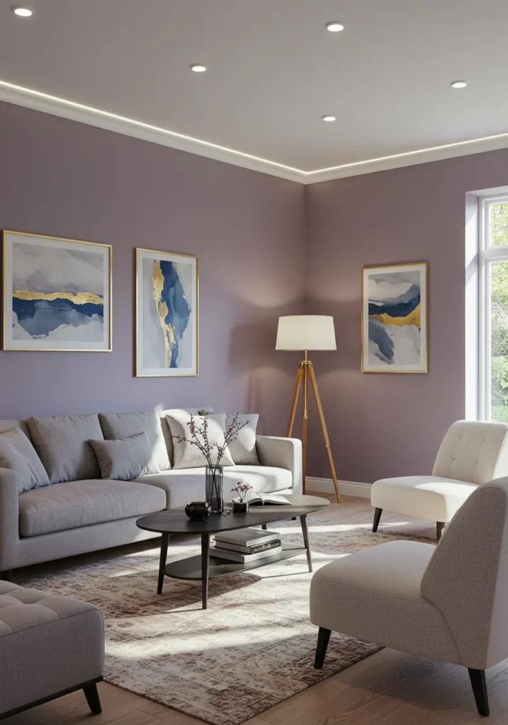
Lavender Fog is a soft, dreamy lavender infused with a touch of cool gray, resulting in a color that feels both delicate and sophisticated. This soothing shade captures the quiet beauty of misty mornings and twilight skies, evoking a sense of calm and serenity. Perfect for living rooms, bedrooms, or any space meant for relaxation, Lavender Fog creates a tranquil atmosphere that encourages rest while still feeling light and refreshing.
What makes Lavender Fog so versatile is its muted character. Unlike brighter purples that can feel bold or playful, this shade leans toward refinement, offering just enough color to bring personality without overwhelming the room. Its subtle gray undertone grounds the lavender, adding a touch of modernity and balance that makes it suitable for both classic and contemporary interiors. Whether used as an overall wall color or as an accent, Lavender Fog feels effortlessly elegant.
Pairing this shade with complementary tones enhances its soft beauty. Crisp whites and silvers highlight its cool undertones, creating a serene, airy palette. Soft pastels such as blush, powder blue, or sage green bring out its delicate charm, while natural textures like linen, rattan, or light wood add warmth and depth. Metallic accents in chrome or brushed nickel can further elevate its understated sophistication.
Ultimately, Lavender Fog is more than just a gentle pastel—it is a color that transforms a room into a peaceful retreat. Its calming presence ensures that your space feels light-filled, welcoming, and refined. Whether your vision is to design a serene sanctuary or simply add a touch of airy elegance, Lavender Fog delivers timeless tranquility with a delicate touch of color.
Ocean Breeze
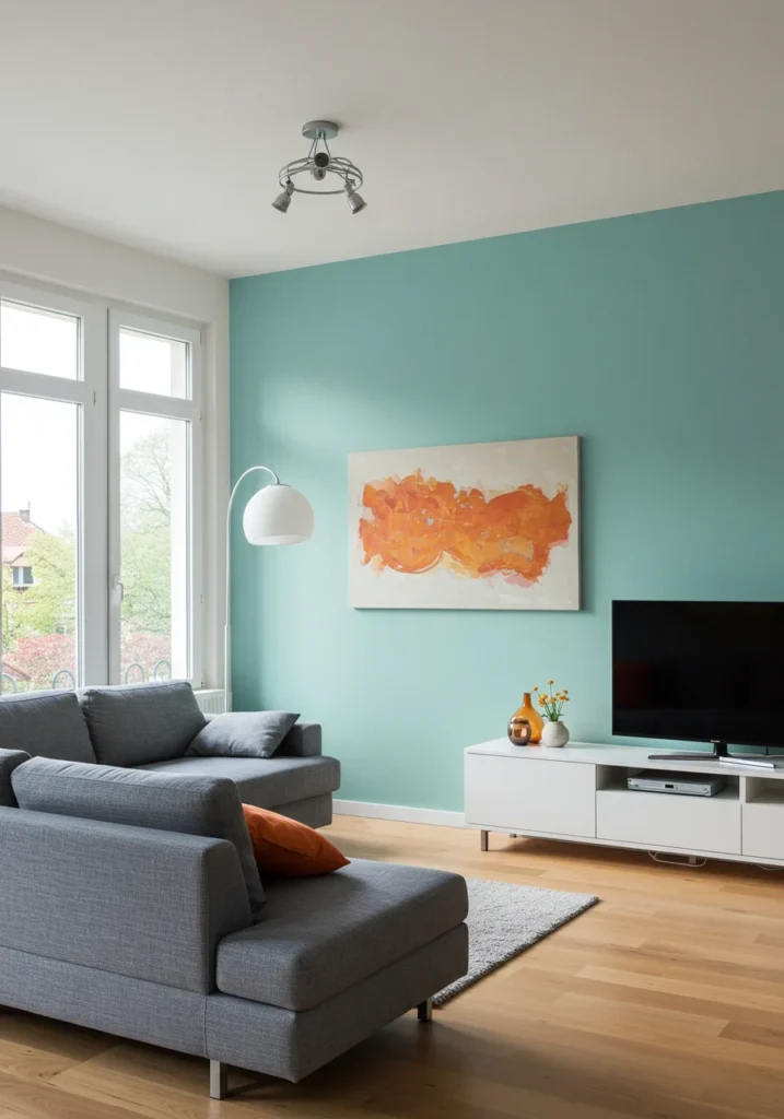
Ocean Breeze is a refreshing, light teal that captures the calming essence of a coastal escape. With its soft blue undertones, this soothing shade brings a sense of openness and tranquility to any living room, instantly evoking the feeling of ocean air drifting through an open window. Gentle and inviting, it creates a cool, airy vibe that brightens a space while maintaining a sense of calm and balance.
What makes Ocean Breeze so appealing is its versatility. Its light, watery quality makes it equally suited for modern coastal-inspired homes as well as contemporary interiors looking for a pop of soft color. Unlike bold teals, this shade is muted enough to serve as a primary wall color, adding personality without overwhelming a room. Its calming nature also makes it a wonderful choice for spaces designed for relaxation, reflection, or gathering with family.
Ocean Breeze pairs beautifully with a variety of complementary tones. Crisp whites highlight its fresh, breezy quality, while sandy neutrals provide warmth and balance, reinforcing its coastal charm. Natural wood accents—whether light oak, driftwood, or even darker tones—bring depth and texture, grounding the palette. For a more modern look, it also works seamlessly with grays and metallic finishes like brushed silver or nickel.
Ultimately, Ocean Breeze is more than just a color—it is a feeling of serenity and renewal. Whether you envision a bright, beach-inspired retreat or a fresh, contemporary living space, this shade offers a breath of fresh air. Its tranquil presence ensures your home feels inviting, harmonious, and effortlessly elegant, echoing the timeless beauty of the sea.
Ivory Cloud
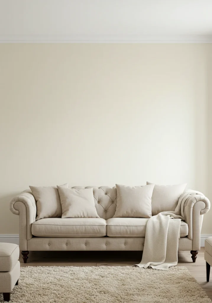
Ivory Cloud is a soft, warm off-white that radiates elegance and serenity. With its creamy undertones, this versatile shade offers a perfect balance of warmth and freshness, creating a backdrop that feels both cozy and refined. Inspired by the gentle softness of drifting clouds, it fills any living room with a sense of lightness and calm, making it an ideal choice for spaces designed for comfort and timeless beauty.
Unlike cooler whites that can feel stark, Ivory Cloud carries a subtle warmth that makes a room inviting while still maintaining a crisp, clean look. Its understated character allows it to adapt effortlessly to a variety of design styles, from modern minimalism to classic elegance. Whether illuminated by natural sunlight or soft evening light, it maintains a gentle glow that enhances the sense of openness and tranquility in the space.
Ivory Cloud pairs beautifully with almost any color palette, making it one of the most versatile neutrals. Bold accents—such as navy, emerald, or charcoal—stand out against its subtle warmth, while soft pastels like blush, lavender, or pale blue highlight its airy charm. Natural wood tones and earthy neutrals complement its creamy undertones, adding depth and grounding balance to the room.
Ultimately, Ivory Cloud is more than just an off-white—it is a foundation of timeless sophistication. Whether you want to brighten a space, create a serene retreat, or provide a versatile canvas for bold décor, this shade delivers. Its soft elegance and adaptability ensure your home feels both welcoming and enduringly stylish, making it a perfect choice for any interior.
Citrus Burst
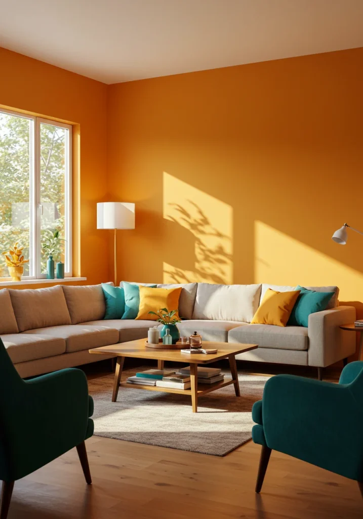
Citrus Burst is a vibrant, zesty orange that infuses any living space with energy and warmth. Inspired by the tangy brightness of freshly ripened citrus fruits, this bold hue brings a sense of joy and vitality to your home. Its lively character makes it a perfect choice for creating a cheerful, welcoming atmosphere, instantly transforming a living room into a space filled with light, positivity, and personality.
What makes Citrus Burst so captivating is its balance between boldness and warmth. While it carries a playful, invigorating quality, its underlying warmth ensures it feels inviting rather than overpowering. This combination allows the color to serve as both a statement and a complement, whether it’s used as an accent wall, on furniture, or throughout an entire room. Its radiant presence makes it ideal for spaces designed to inspire creativity, conversation, and togetherness.
Pairing Citrus Burst with other colors enhances its dynamic charm. Crisp whites and warm neutrals soften its vibrancy while maintaining brightness, while contrasting shades such as deep blues or forest greens create striking, dramatic combinations. For a more contemporary palette, metallic accents like brushed gold or copper highlight its warmth and add a touch of sophistication.
Ultimately, Citrus Burst is more than just a color—it’s an experience of energy, freshness, and fun. Whether you’re aiming to make a bold design statement or simply want to infuse your living room with lively charm, this shade delivers. Its ability to uplift and brighten ensures that any space feels warm, inviting, and full of life, making Citrus Burst a timeless choice for those who embrace color with confidence.